
A Beginner's Walkthrough Matplotlib Python
Why Visualize the Data?
Until now we’ve analyzed our data based solely on whatever the descriptive statistics that pandas showed us. But statistics could be very misleading take Anscombe’s Quartets for example. In Anscombe’s Quartets, we have 4 datasets with the same descriptive statistics, but when visualized we could see that all the datasets were anything but similar.
That is why descriptive statistics should only be a step of the analysis pipeline and not the pipeline itself.
Plots in Matplotlib Python
Matplotlib is a data visualization library in Python. The pyplot, a sublibrary of matplotlib, is a collection of functions that helps in creating a variety of charts. Using matplotlib you can plot various plots very easily. Let’s take a look at various plots that it has to offer:-
- Line Plot
- Scatter Plot
- Histogram
- Bar Plot
- Pie Chart
- Box Plot
We’ll see how you can create them in this tutorial. For this tutorial, we’ll be using the Housing Price Dataset on Kaggle. For simplicity, I’ll remove every column with a NaN value.
df = pd.read_csv('data.csv')
df.dropna(axis = 1,inplace = True)
df.head()
Importing Matplotlib
Conventionally, we don’t import matplotlib as a whole instead we import a subclass called pyplot, as plt, along with an optional magic expression.
import matplotlib.pyplot as plt
%matplotlib inline
%matplotlib notebook: It will display interactive plots within the notebook.
%matplotlib inline: It’ll display static images in the notebook.
Plotting Data using Matplotlib
Line Plot
Line plots are used to represent the relation between two data X and Y on a different axis. So basically a line plot is a plot where points are connected via points. We can create them using plt.plot().

Line Plot using matplotlib in Python
It assumes the values of the x-axis to start from zero going up to as many items in the data.
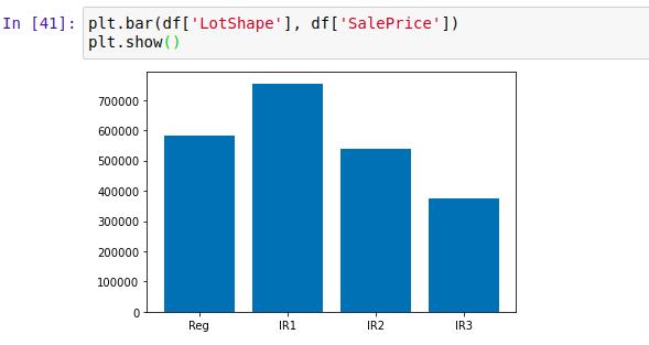
Scatter Plot
A Scatter plot is a plot that is used to represent the relation between 2 features. You can create them using plt.scatter().

Scatter Plot
And as you can see we created a scatter plot above with the x-axis a the column 2ndFlrSF and the y-axis column SalePrice. And as seen in the graph we can say that the more the value of 2ndFlrSF more the value of SalePrice. But there are houses that don’t have the 2nd floor that’s why there are so many points on x = 0.
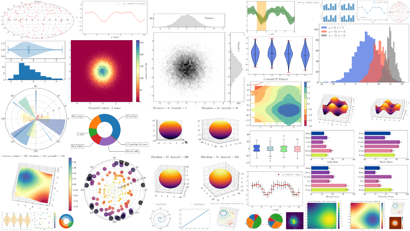
Histogram
A histogram is used to visualize frequency distributions. The bars in the histogram represent the frequency of the variable in a particular range, the size of this range is determined by bin size. You can set bin size manually by passing it as a value for the bins argument. You can create them using plt.hist().
Histogram in Matplotlib in Python
You can either manually find bin size or you can use formulas like Sturge’s rule, Rice’s rule, etc. to find it.
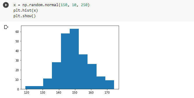
Bar Plot
A bar plot presents categorical data with bars with lengths proportional to the values that they represent. You can create them using plt.bar().
Barplot
The histogram presents numerical data whereas the bar graph shows categorical data. The histogram is drawn in such a way that there is no gap between the bars.
Box Plot
Boxplot is used to visualize the 5-number summary of a distribution. Box plots can show outliers which are displayed as a circle. You can create them using plt.boxplot().

Box Plot in Python Matplotlib
- The red line is the median.
- The lowest line is the minimum non-outlier value.
- The highest line is the maximum non-outlier value.
- The highest line of the box is the 3rd quartile value.
- The lowest line of the box is the 1st quartile value.
Pie chart
A Pie Chart is a circular statistical plot that can display only one series of data. Matplotlib has pie() function in its pyplot module which creates a pie chart representing the data in an array.

pie chart
Customize the Plot
Adding Label Axis
Until now, our x and y-axis were empty which made it difficult to determine which axis represented what. Since labeling is necessary for understanding the chart dimensions, we will see how to add labels to the plot. In order to set labels, we can pass them as arguments in xlabel() and ylabel().
Adding label axis in matplotlib python
Adding Title of the Plot
While working with plots it becomes essential to tell what plot represents what. This can be done by adding a Title to the graph to be shown above. We can do that by bypassing the title as an argument to plt.title()

Adding Title of the Plot
Adjusting Plot Size
After visualizing for some time now you might have found out that regardless of the amount the size of the plot is the same. But you can adjust the plot size by passing the tuple i.e. the shape of the plot as an argument to plt.figure().

Adjusting Plot Size in Matplotlib Python
Plotting 2 Plots in One
In matplotlib, you can create 2 scatter plots in one by simply adding code for another one.

Plotting 2 Plots in One
Adjusting Opacity of the Dots
The plot above has orange points overlapping the blue points. We can adjust the opacity of the dots by changing the value of the alpha argument. By default, alpha is 1. Hence lesser the alpha value the lesser the opacity.
Adding Legend
If we were to show someone the above plot it’ll be hard to determine what dot color represented which variable. In order to tackle this, we can add the label for each plot to be displayed in the legend using plt.legend().

Adding legend to Python Matplotlib Visualization
Making Subplots
We have seen how we can create 2 scatter plots in the same plot. But we can actually create them separately as 2 separate subplots. We can create subplots By using plt.subplot2grid(), which takes 2 tuples of the grid size and coordinates the particular plot. For Eg: The following subplots are made in 1 row 2 column grid at (0,0) and (0,1) coordinates. We can also specify the span of the plot using rowspan and colspan arguments.
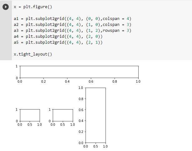
Making subplots
We can assign a1 and a2 the corresponding plots they have to display along with their respective customization.
Matplotlib is a great tool for visualization but as the plot grows more complex it becomes harder to plot, along with it there are many plots not supported by matplotlib.